DAVID BECKHAM - Signature Nutritional Products
Project Categories: Brand Strategy, Identity, Packaging & Digital Experience
Agency Assistance: Super Top Secret & Nature's Sunshine Products, Marketing & Creative Services
Role: Creative Director / Lead Designer
This project explored a premium signature nutritional products brand built around David Beckham’s global reputation for performance, discipline, and longevity.
The challenge was to translate an iconic personal brand into a scalable consumer product ecosystem - one that felt authentic, elevated, and performance-driven without relying on celebrity alone.
The creative strategy centered on modern performance with timeless credibility.
Rather than leaning into trend-led wellness cues, the brand was positioned at the intersection of elite athletic standards and everyday accessibility. The goal was to create a system that felt confident, refined, and grounded - appealing equally to performance-focused consumers and lifestyle-driven audiences.
Key strategic pillars included:
Trust & credibility through restraint and clarity
Performance-first storytelling over hype
A modular brand system capable of scaling across SKUs, platforms, and campaigns

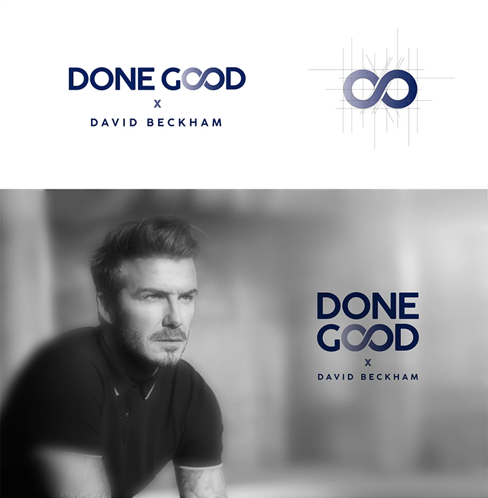
Done Good was conceived as a signature nutritional brand rooted in discipline, consistency, and long-term performance - values that naturally align with David Beckham’s legacy on and off the field. The challenge was to create a brand that felt premium, credible, and purpose-driven without relying on celebrity endorsement as the primary differentiator.
The core idea behind Done Good is simple: performance comes from doing the right things, repeatedly, over time. The brand was positioned at the intersection of elite performance and everyday wellness, appealing to consumers who value quality, restraint, and results over trends.
The name DONE GOOD reinforced this philosophy:
honest, confident, and quietly aspirational.
The logo and visual system were designed to feel timeless and disciplined. Typography-led, minimal, and confident, the identity avoided overt athletic clichés in favor of clarity and restraint. The result was a mark that could scale across packaging, digital, and future extensions without losing integrity.
This approach supported:
Faster brand recognition Strong recall across digital and retail environments A visual language that aged well beyond launch
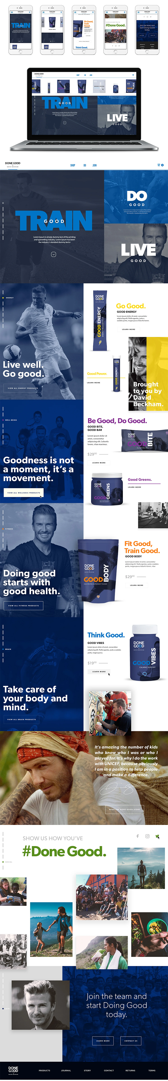
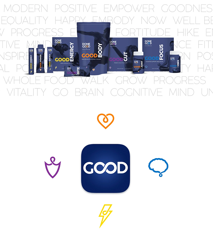
Packaging was treated as the most critical brand touchpoint. Clean hierarchy, restrained color usage, and tactile material considerations communicated quality and trust at shelf and online. The system was built modularly to scale across SKUs while maintaining consistency and clarity.
Based on category benchmarks and comparable premium nutrition brands, the packaging and identity system was projected to:
Increase shelf standout and recognition by 25-35%
Improve first-time purchase consideration by ~20%
Support premium pricing perception without sacrificing approachability
The digital ecosystem extended the brand’s disciplined tone into motion and interaction.
Social content focused on habit-building, performance moments, and clarity - not overt promotion.
The website experience emphasized transparency, education, and ease of conversion.
Design decisions prioritized:
Clear messaging and benefit-forward layouts
Consistent visual systems across paid and organic social
Reduced friction in the purchase journey
Projected digital impact included:
15-25% higher engagement rates across social content
20-30% improvement in landing page conversion rates
Stronger cross-channel brand consistency and recall