
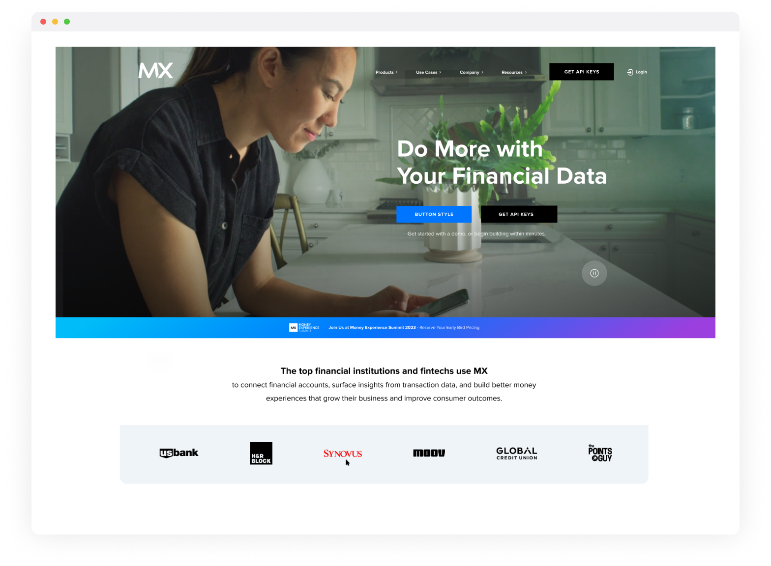
MX Technologies, Inc.
Customer Event Digital Experience Page Designs
UI & Visual Design
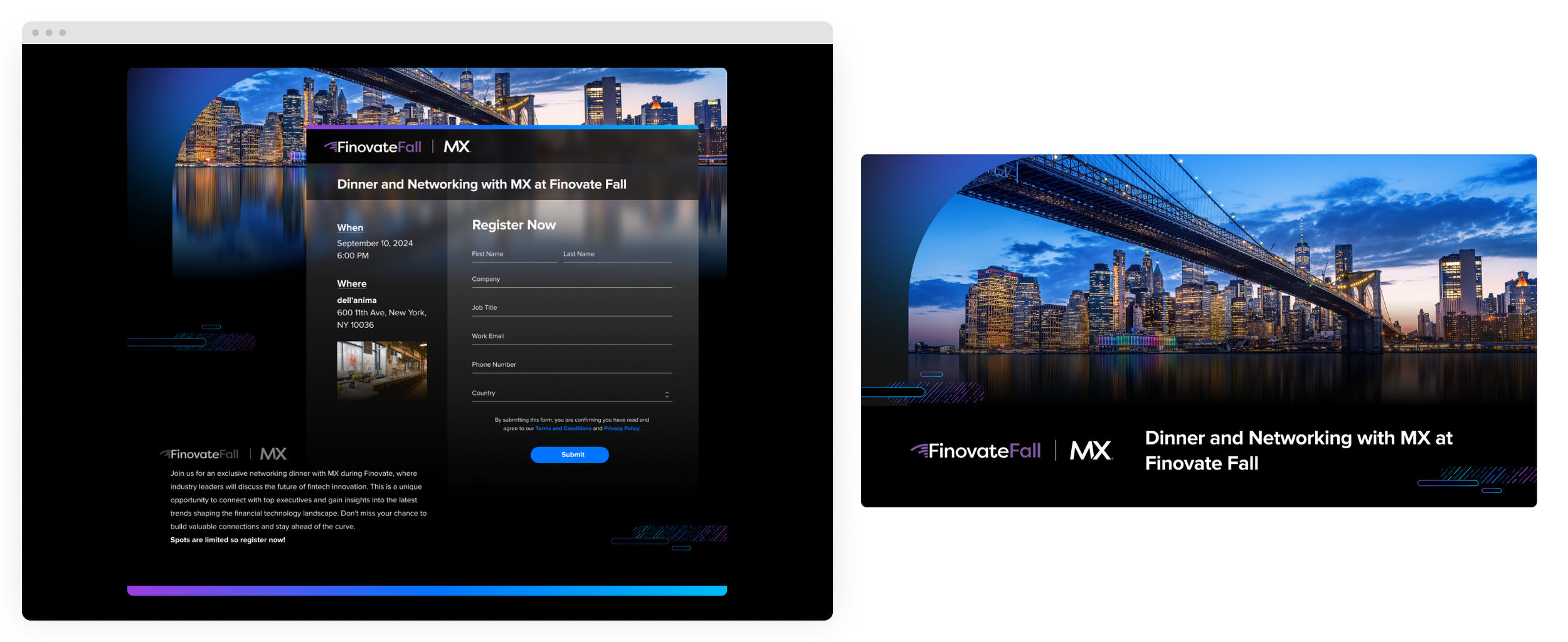
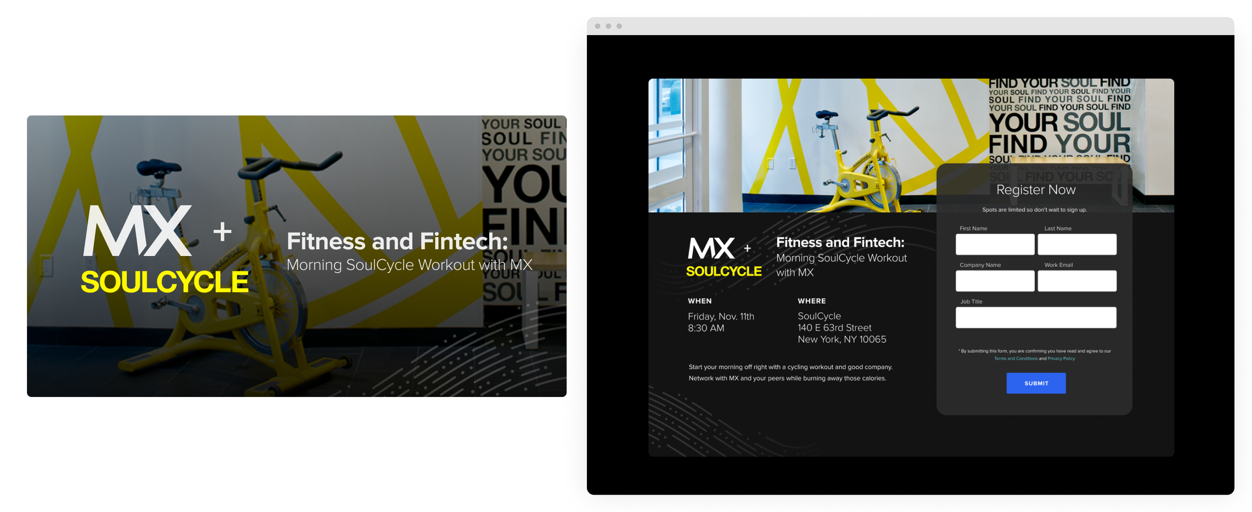
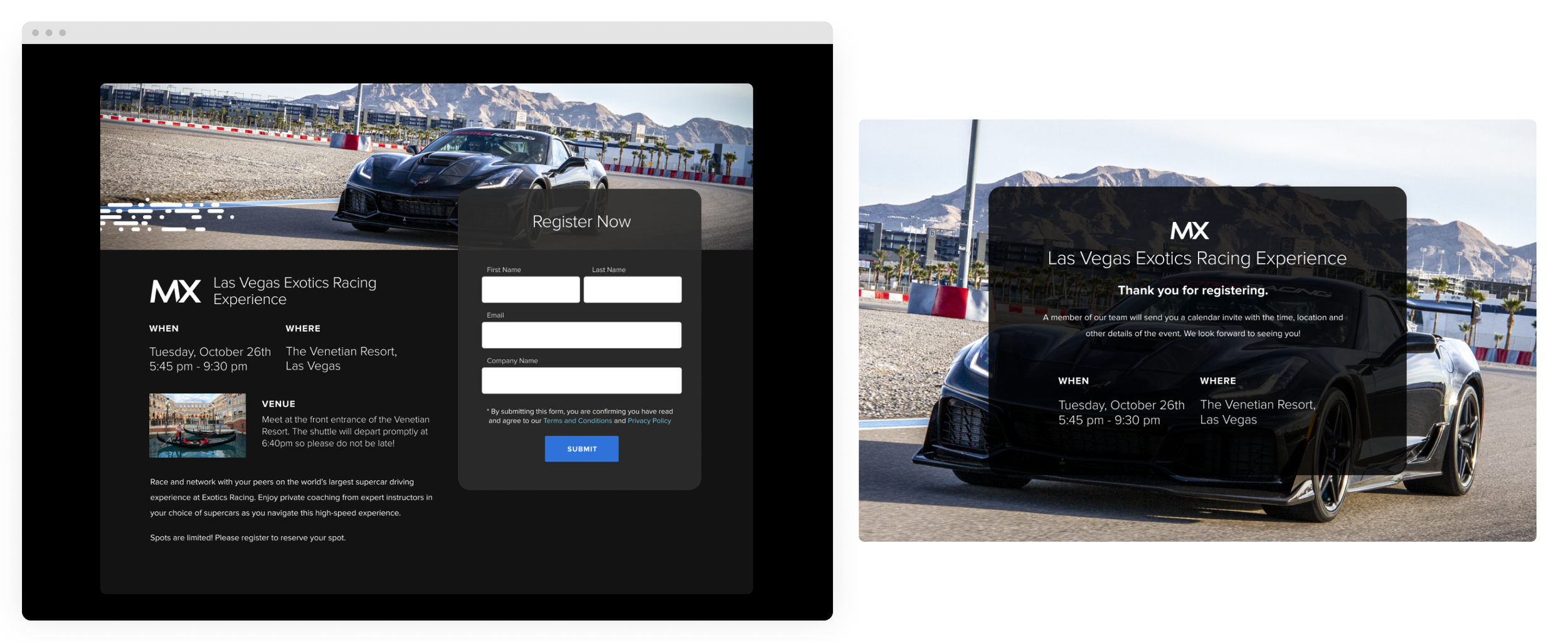
MX customer event pages were designed to clearly communicate the purpose and value of each event while guiding users toward a single action: attendance.
The experience prioritized clarity, scannability, and strong visual hierarchy to quickly answer what the event is, who it’s for, and why it matters. By reducing friction and balancing brand storytelling with performance-driven UX, the pages helped turn interest into intent and drive higher event registration.
Entrata
Website Redesign
UI & Visual Design
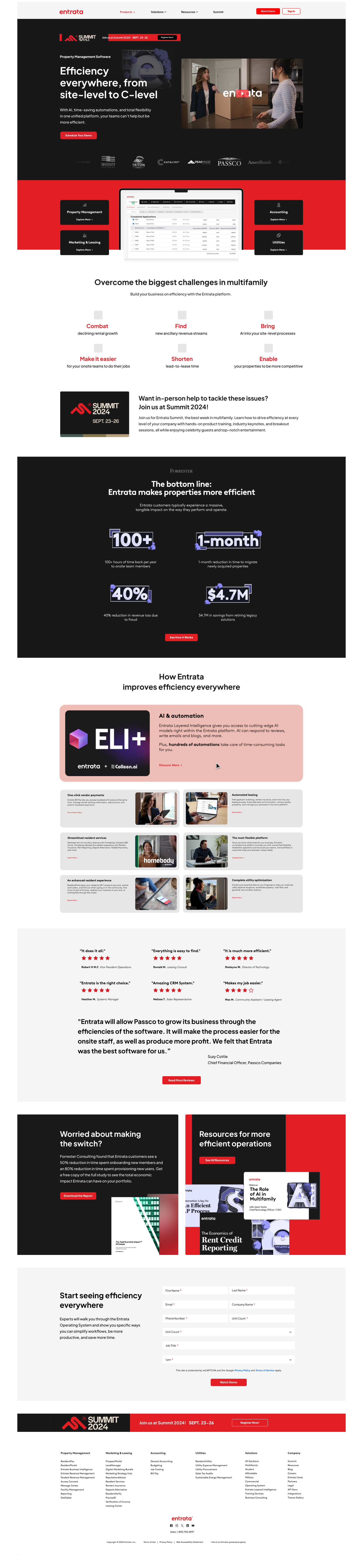
Entrata a leading, all-in-one property management software provider for the multifamily housing industry-engaged me to lead creative direction and user interface design for a full website redesign.
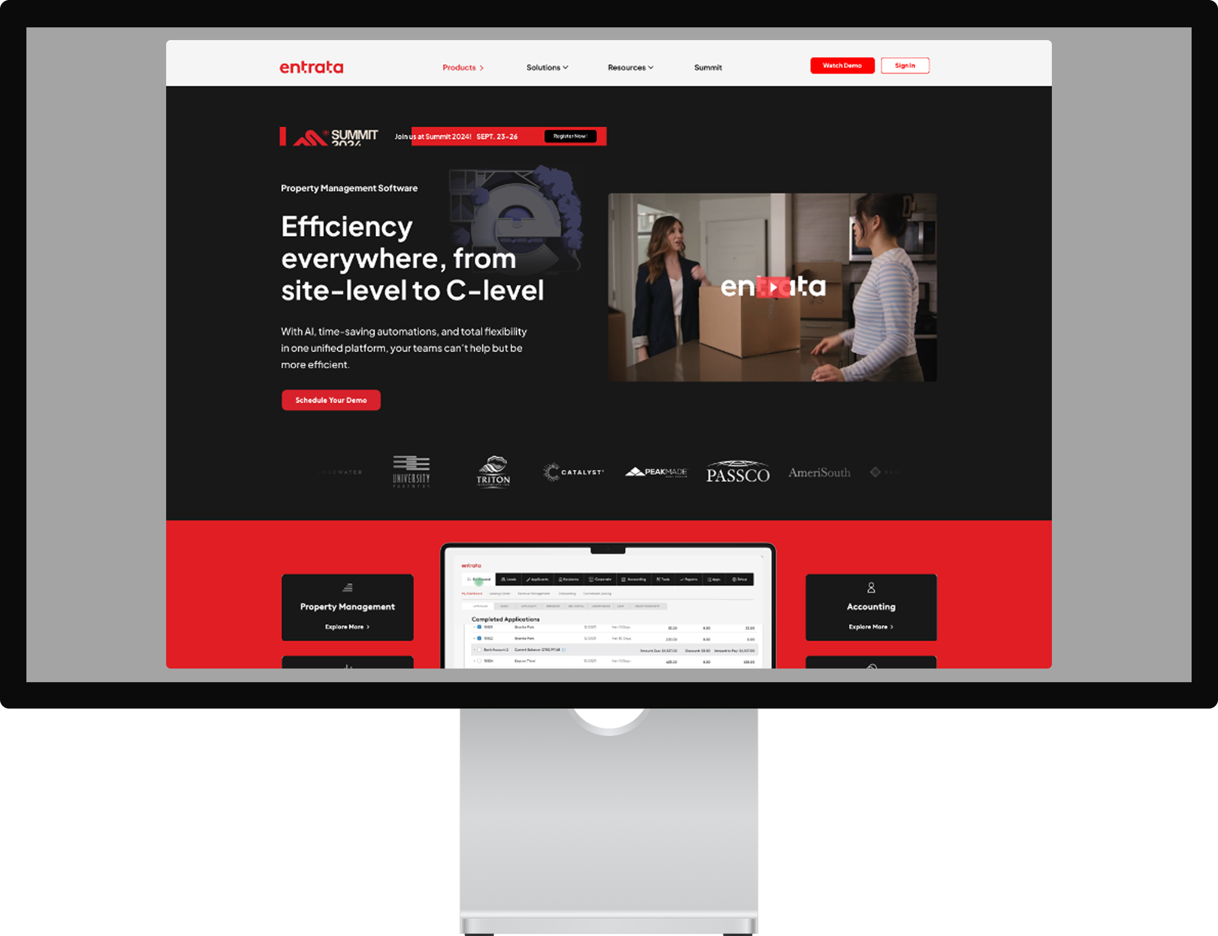
The goal was to modernize the digital experience while clearly communicating the breadth and sophistication of Entrata’s platform without overwhelming prospective customers.
The challenge was scale and clarity. Entrata’s offering spans multiple products, audiences, and use cases, requiring a user experience that felt intuitive, cohesive, and approachable while still reflecting the company’s enterprise-level credibility. My approach focused on translating Entrata’s brand into a clean, confident UI system-using strong hierarchy, simplified navigation, and purposeful visual storytelling to guide users through complex information with ease.
By aligning brand expression with user intent, the redesigned experience helped clarify Entrata’s value proposition, improve discoverability across the platform, and create a more confident, frictionless path for prospects exploring the product. The result was a website that feels both powerful and accessible-supporting Entrata’s growth while reinforcing trust in a highly competitive market.
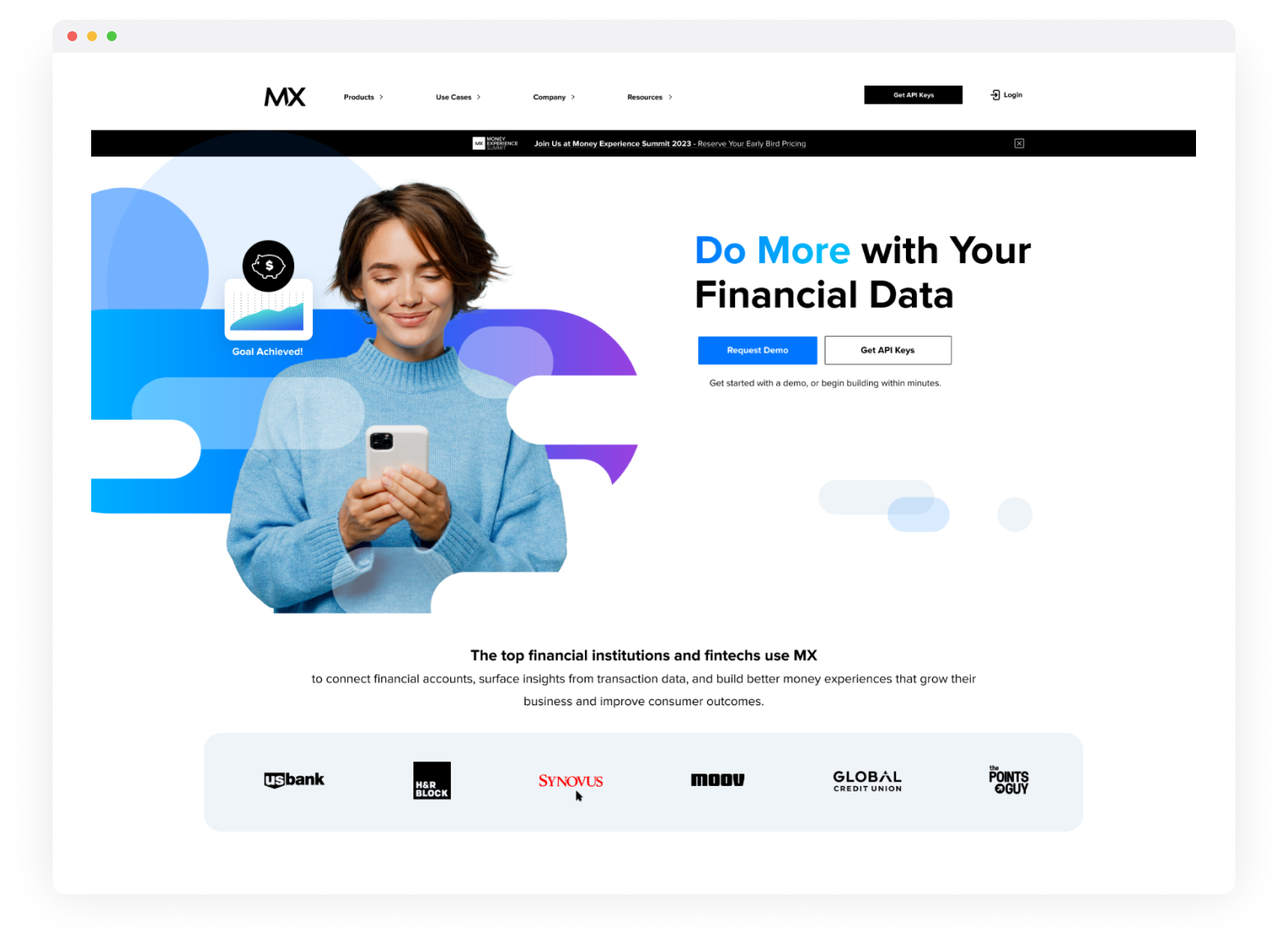
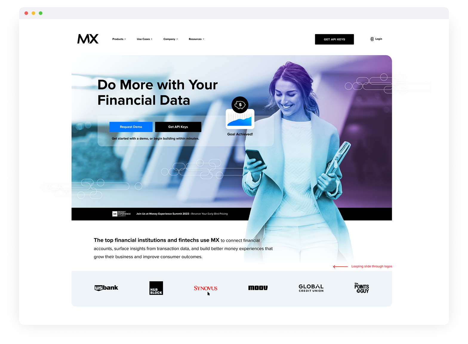
MX at Money20/20, Las Vegas
MX Event Landing Page Design
UI & Visual Design
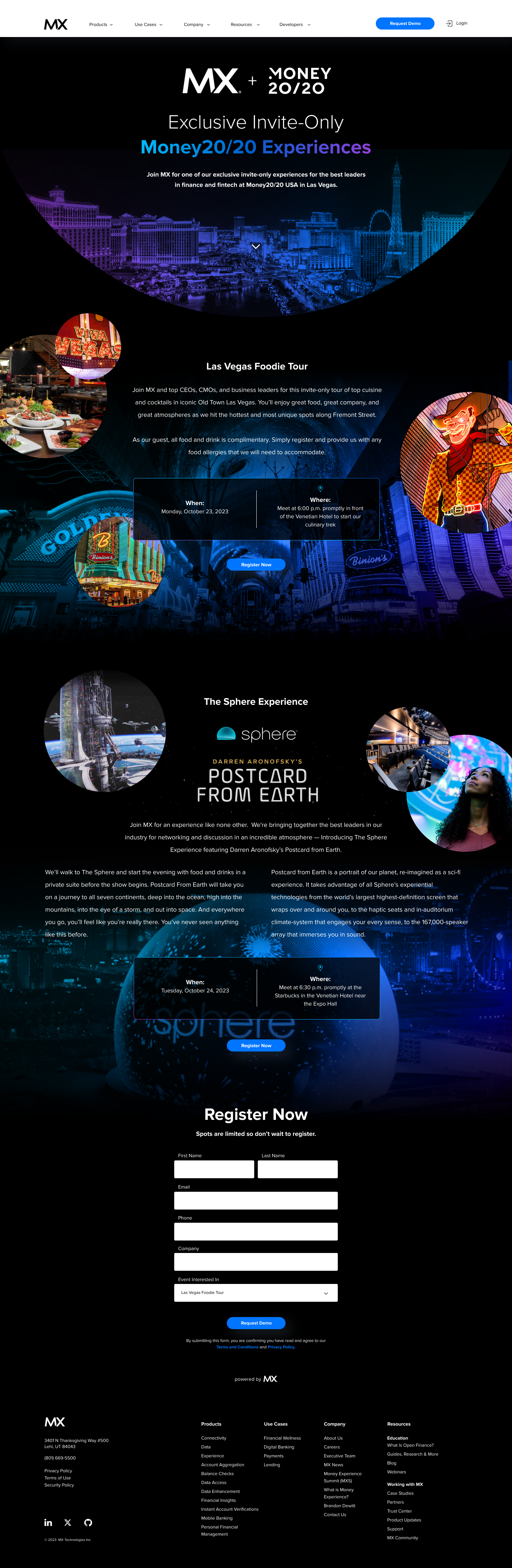
The MX at Money20/20 landing page was designed as a central hub for the brand’s presence at one of the most influential fintech conferences in the world.
The goal was to clearly communicate MX’s role at the show while driving meaningful engagement across multiple objectives — breakout sessions, executive meetings, sales conversations, and exclusive keynote sign-ups.
From a design and UX perspective, the challenge was prioritization. The page needed to serve diverse audiences - prospects, partners, and industry leaders - without overwhelming them. My approach focused on strong content hierarchy and clarity, allowing users to quickly understand why MX mattered at Money20/20, where to find the brand on-site, and how to engage at a level relevant to them.
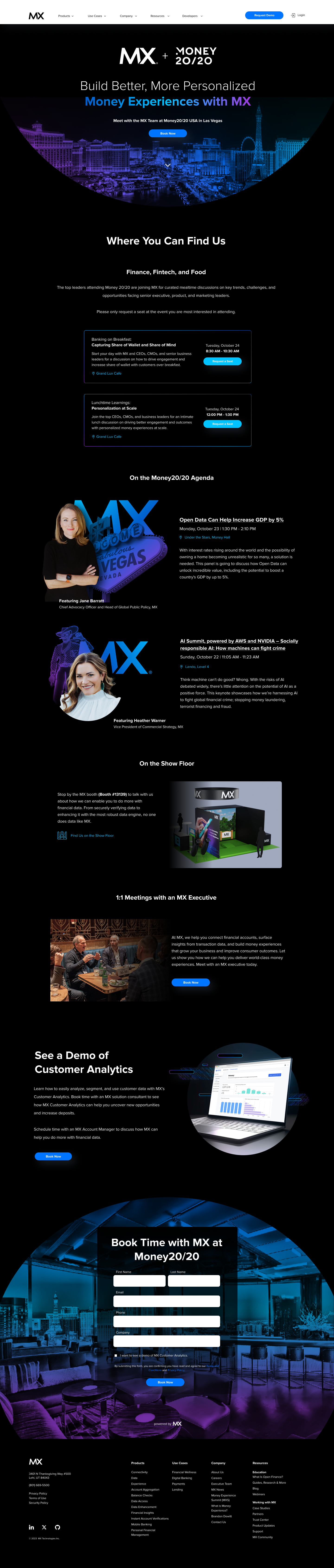
Breakout sessions and speaking engagements were highlighted to reinforce MX’s thought leadership, while dedicated pathways made it easy for executives and sales leaders to schedule meetings in advance. Clear calls to action guided users toward key moments, including registration for private keynotes and special events, turning the page into both an informational destination and a conversion tool.
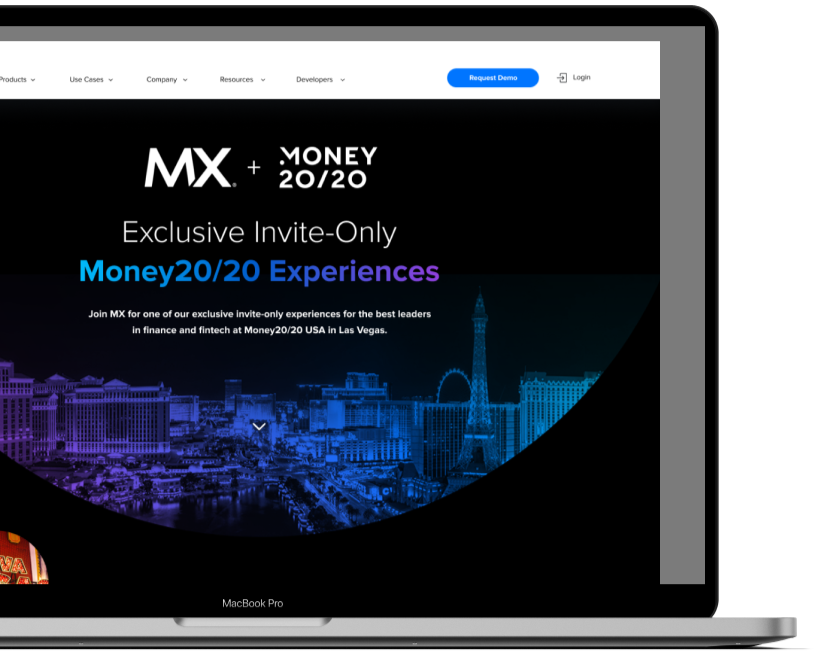
Visually, the design balanced MX’s brand credibility with the energy of the Las Vegas setting - creating a confident, polished experience that stood out in a crowded event landscape.
Ultimately, the landing page helped unify MX’s event presence, increase attendance at key sessions, and facilitate higher-quality conversations before, during, and after the conference.
MX Technologies, Inc.
Money Experience Summit, GOLD PASSSnowbird, UT
Event Landing Page Design
UI & Visual Design
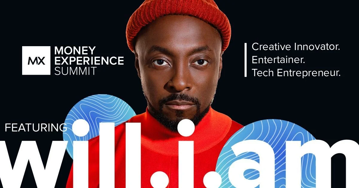
MX Money Experience Summit (MXS) Hosted annually at Utah’s Snowbird Resort, the Money Experience Summit is an invite-only gathering of financial and fintech leaders. The event brings together visionary speakers, forward-thinking conversations, collaborative workshops, and high-level executive networking focused on the future of money and digital experiences. The top-tier “Gold Pass” offered an elevated, more personalized experience with exclusive access and premium programming for senior leaders.
For the 2022 summit, MX announced a headline keynote from will.i.am, along with a private entertainment experience featuring DJ sets by will.i.am and apl.de.ap of the Black Eyed Peas, joined by DJ Ammo. The concert-and-cocktails evening stood out as a signature highlight, reinforcing MXS as one of the most memorable and engaging events in the finance and fintech space.
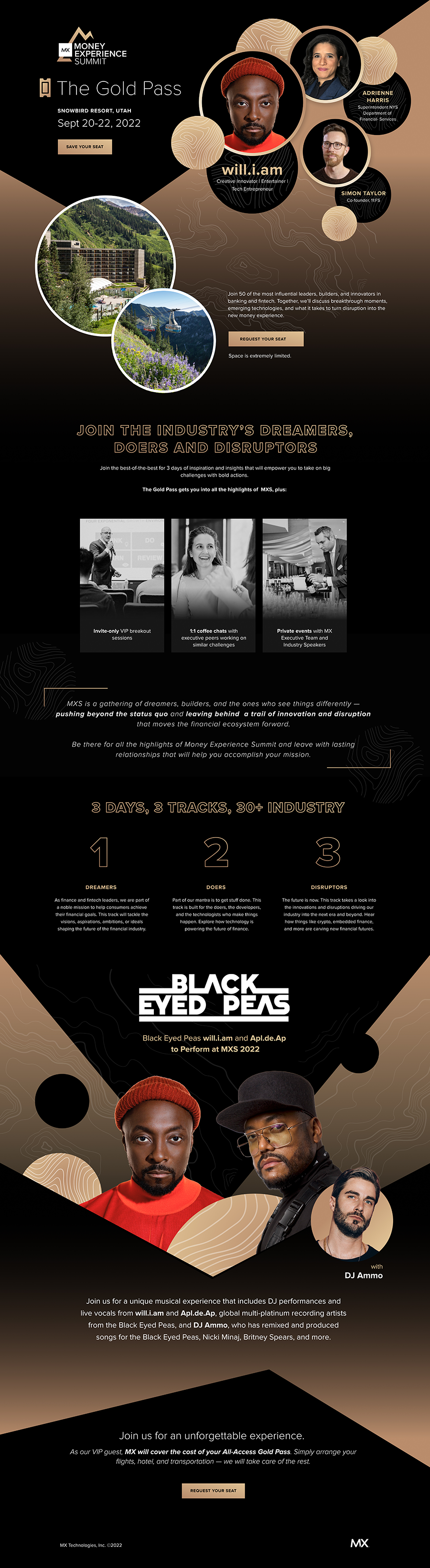
As Creative Director at MX, I led the overarching creative vision and execution across the summit’s brand ecosystem, from concept development through launch. Central to that vision was establishing a bold black-and-gold visual identity that immediately signaled exclusivity, confidence, and premium positioning.
The deep matte blacks created a dramatic, immersive canvas, while rich metallic gold accents conveyed prestige, sophistication, and executive-level access. This refined palette, elevated MXS beyond a traditional fintech conference and positioned it as a luxury, invite-only leadership experience.
To strengthen the overall summit branding, I incorporated the headline entertainment into the broader MXS communications strategy across email and social. Rather than presenting the concert as a standalone attraction, I positioned the will.i.am and apl.de.ap (Black Eyed Peas) performance as part of the summit’s narrative, where innovation, leadership, and culture intersect.
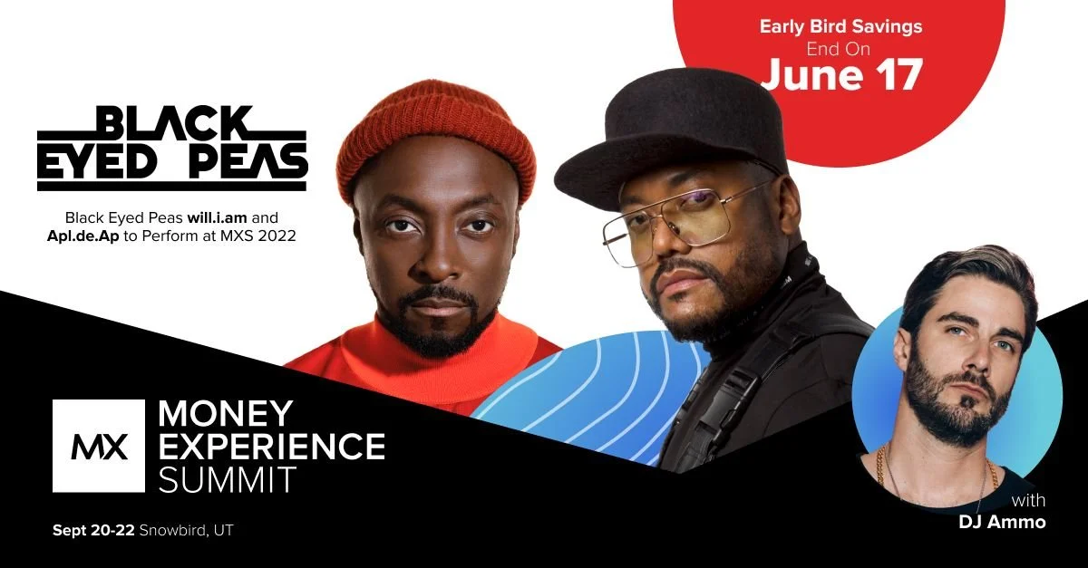
By weaving the entertainment into the same elevated voice, tone, and visual system as the conference programming, the performance became a brand amplifier rather than a promotional add-on. The integrated branding generated significant buzz leading up to the event, increased email engagement and social interaction, and heightened perceived value of attendance.
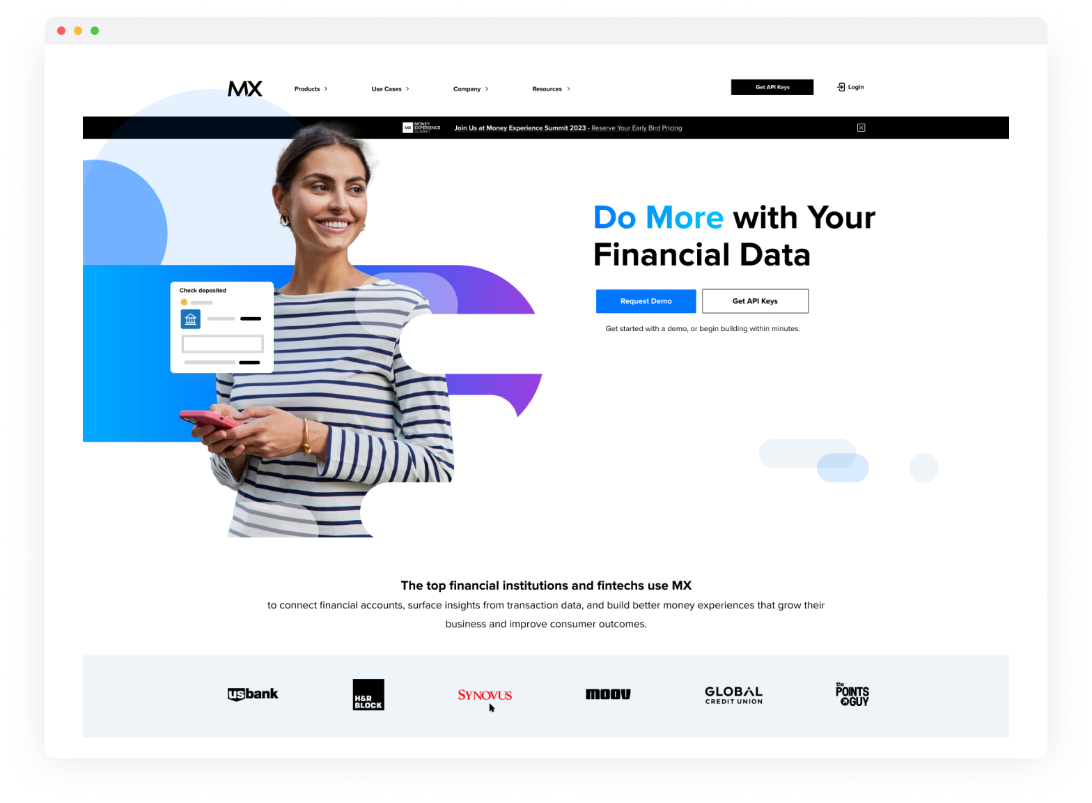
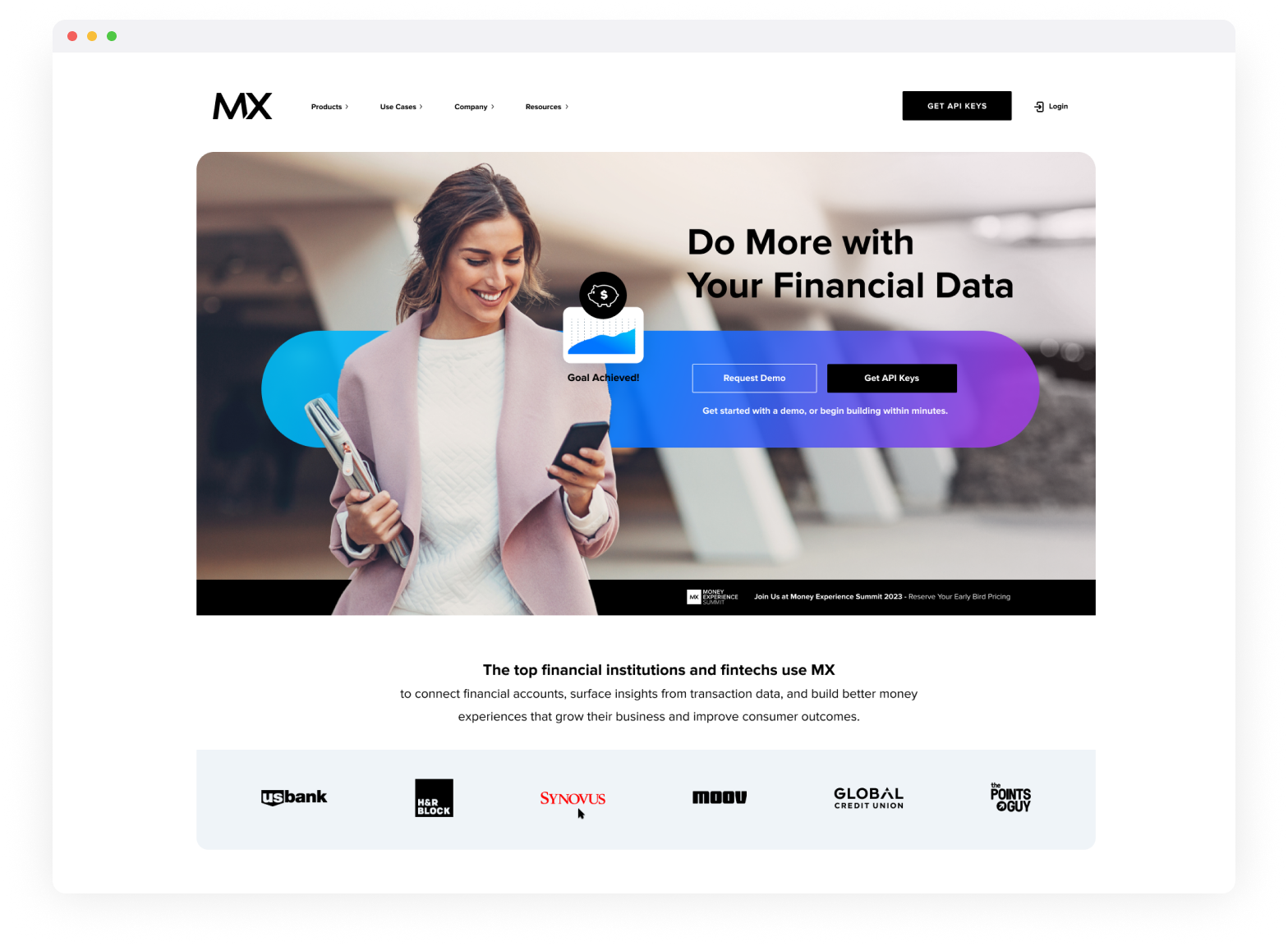
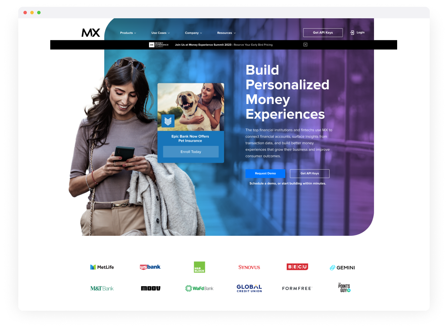
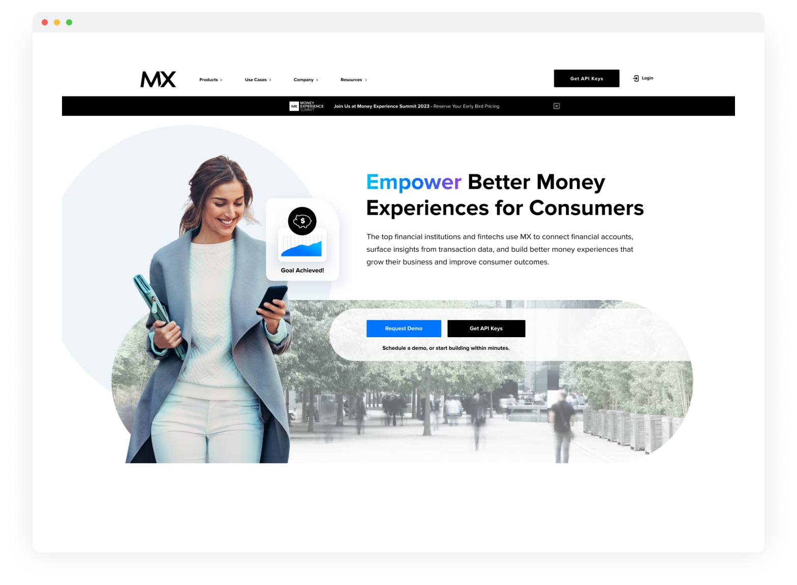
MX Technologies, Inc.
MX Company Landing Page Redesign, Proof of Concepts
Brand Evolution - Creative Direction & UI/UX
As Creative Director, I led the visual design for a series of proposed MX homepage proof of concepts created during a broader exploration of evolving the company website. The objective was not a full rebrand, but a thoughtful brand evolution-one that preserved MX’s established visual equity while refining how the brand communicated its value.
The concepts intentionally retained MX’s core visual assets, including the color palette, typography, and foundational design system. These elements were already well recognized within the financial industry and conveyed trust, modernity, and approachability. Rather than disrupt that recognition, the work focused on strengthening and modernizing how those assets were applied across layout, hierarchy, and motion.
The primary shift came through revised messaging and storytelling. The homepage concepts explored clearer value propositions, more confident language, and a stronger narrative flow-helping visitors more quickly understand who MX is, what it enables, and why it matters. Visual design and messaging were developed in close partnership to ensure clarity without sacrificing warmth or personality.
These proof of concepts demonstrated how MX could evolve its digital presence in a way that felt familiar yet forward-looking-maintaining brand continuity while better aligning the website experience with the company’s maturity, market leadership, and long-term vision.
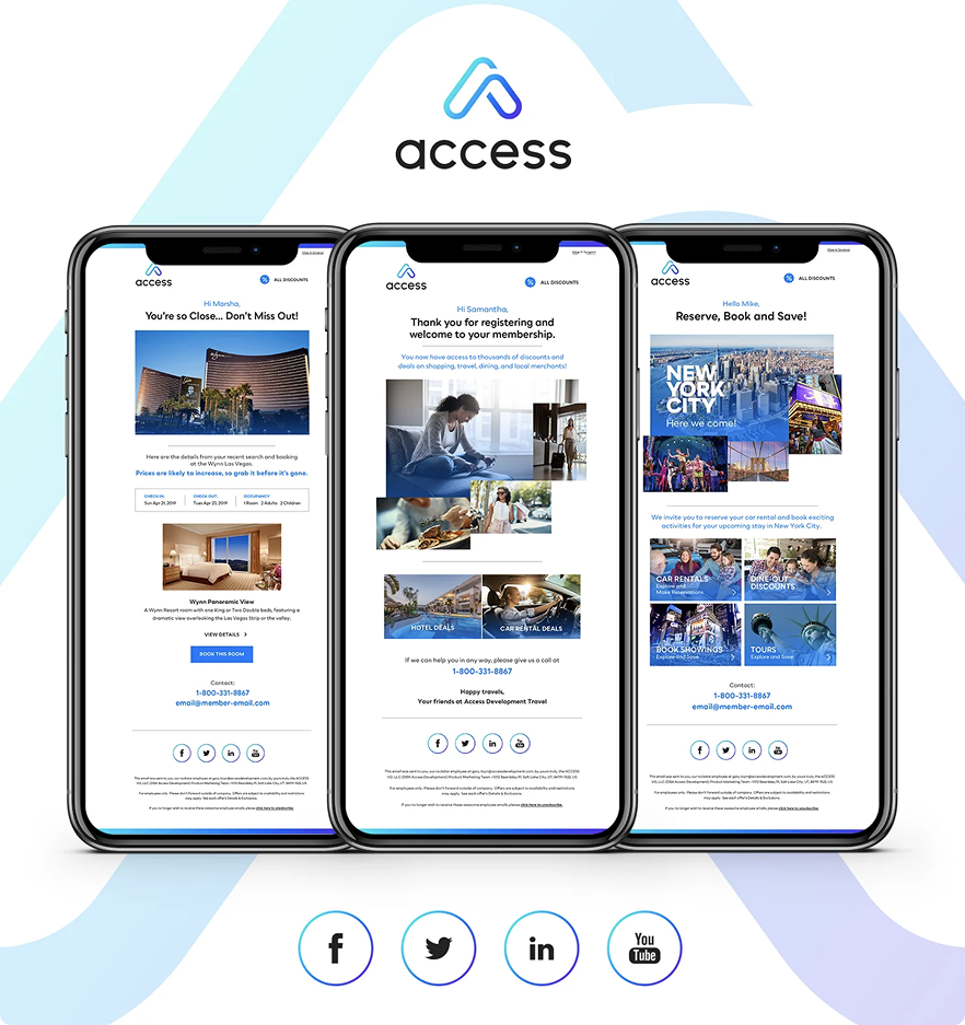
Access Development
Homepage Proof of Concepts
UI & Visual Design
Access Development, the loyalty platform powering America’s largest private discount network, engaged me to help elevate their mobile commerce user experience following a company-wide brand refresh.
The focus was on translating the new brand into a clear, intuitive, and conversion-driven interface that improved usability without sacrificing scale or performance. My work centered on refining UI patterns, visual hierarchy, and interaction clarity to create a more seamless, modern shopping experience that aligned brand expression with real user behavior.
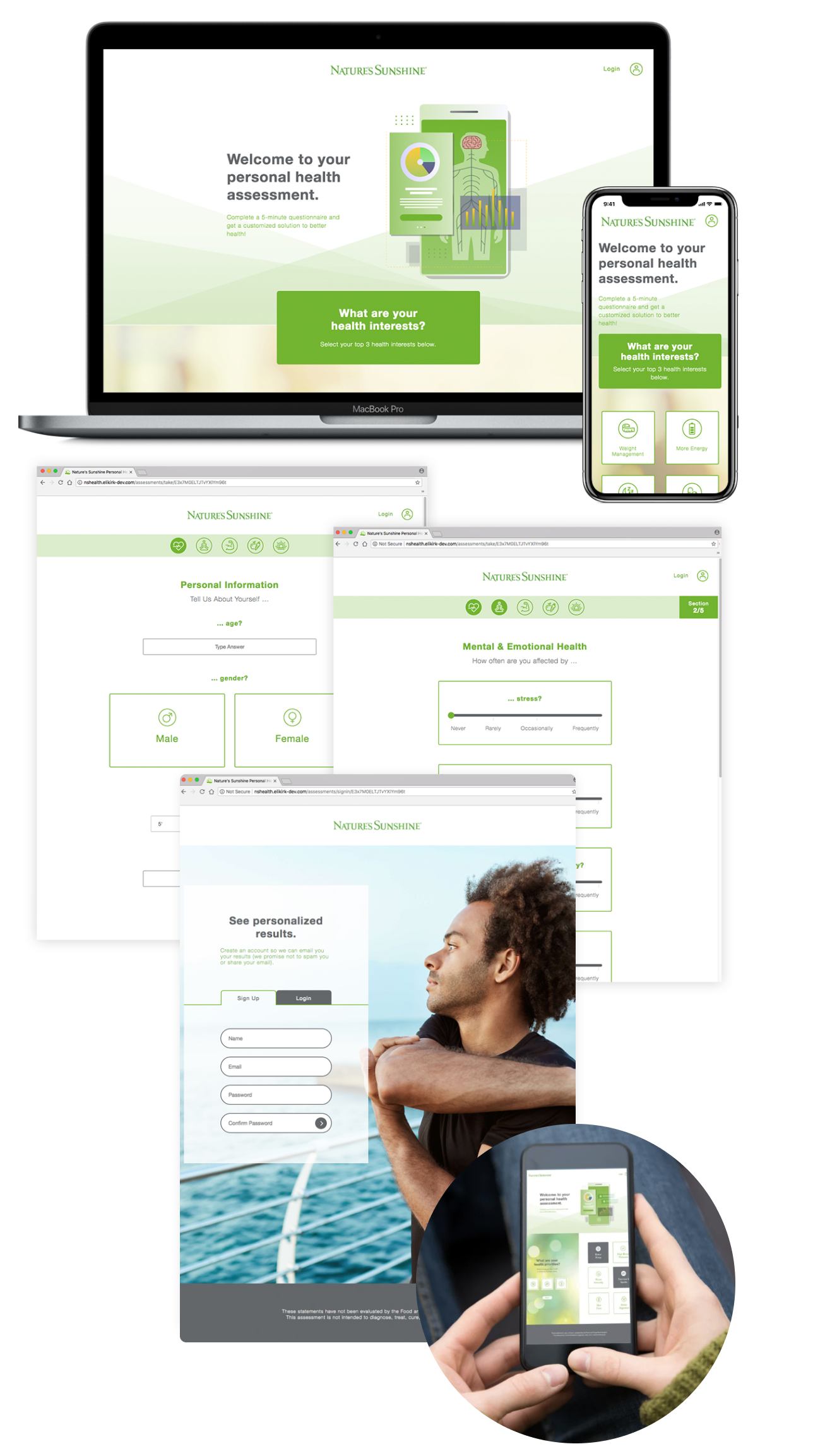
Nature’s Sunshine Products, Inc.
Online Personal Health Assessment - Branding & Landing Page
Creative Direction, UI & Visual Design
At Nature’s Sunshine, my team and I were tasked to create a user interface design for their Online Personal Health Assessment landing page-a key digital touchpoint designed to help users better understand their health needs and product recommendations.
The challenge was balancing a guided, data-driven experience with Nature’s Sunshine’s trusted, wellness-focused brand, while keeping the process approachable and easy to complete.
My approach focused on translating the brand’s credibility, warmth, and natural positioning into a clear, supportive user experience. Thoughtful visual hierarchy, calm color usage, and intuitive UI patterns were used to reduce friction, build confidence, and encourage completion. By simplifying complex health inputs into a structured, digestible flow, the experience helped users feel informed rather than overwhelmed—turning a potentially intimidating assessment into an engaging and successful brand interaction.
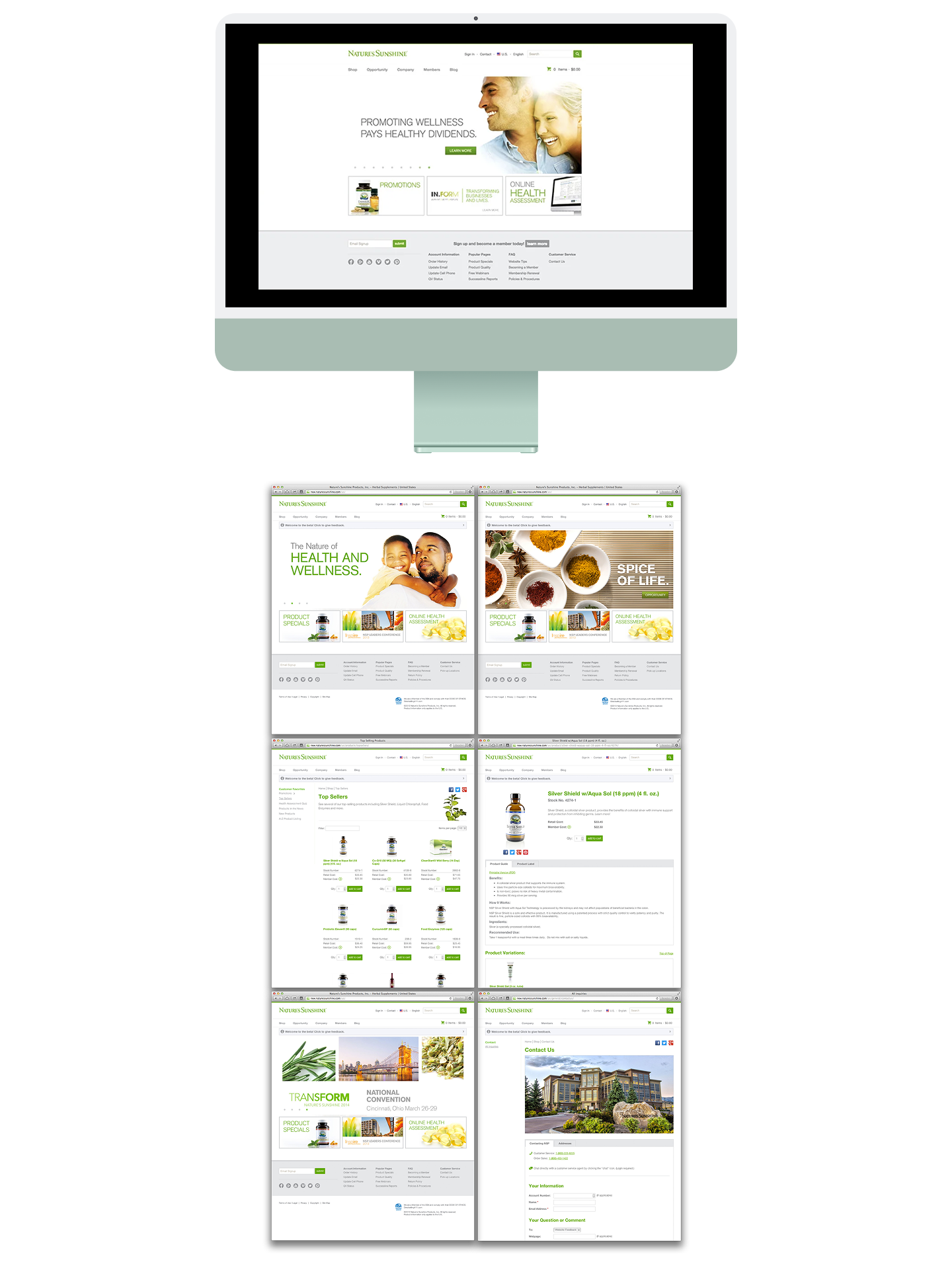
Nature’s Sunshine Products, Inc.
Website Redesign/ Brand Refresh
Creative Director/ Design Lead
At Nature’s Sunshine, I led a the creative direction and user interface design for a full website redesign, with the goal of modernizing the experience while preserving the brand’s long-standing credibility in the wellness space. The challenge was creating a digital experience that felt clean, contemporary, and easy to navigate-without losing the warmth, trust, and educational depth that define the Nature’s Sunshine brand.
My approach focused on translating the brand’s natural, science-backed positioning into a clear and intuitive UI system. Visual hierarchy, refined typography, and calm, purposeful color usage were used to simplify complex content and guide users confidently through the site. By reducing friction, clarifying pathways, and aligning brand expression with user intent, the redesign created a more approachable, cohesive experience-one that supports discovery, builds trust, and helps users move forward with confidence.
Bard Access Systems, Inc.
Quote Ultrasound Imaging Capital App (QUIC)
Art Director, UI Design
I was engaged by the marketing and sales teams at Bard Access Systems to design a mobile, interactive tablet application-the Quote Ultrasound Imaging Capital App (QUIC), to support sales team members in the field. The challenge was to create a user interface capable of managing complex product configurations and pricing logic while remaining fast, intuitive, and easy to use during live customer conversations.
The experience needed to reflect Bard’s clinical credibility and precision while functioning as a practical sales enablement tool. My approach focused on clarity, structure, and confidence-translating the brand’s professional, medical-grade standards into a clean, focused interface optimized for tablet use. Clear hierarchy, streamlined workflows, and intuitive interaction patterns reduced friction and cognitive load, allowing sales teams to move seamlessly from discussion to quote generation.
By aligning brand expression with real-world sales behavior, the QUIC app became a reliable, efficient extension of the Bard sales experience-helping teams work more confidently, respond faster in meetings, and deliver a more polished, professional customer interaction.
